
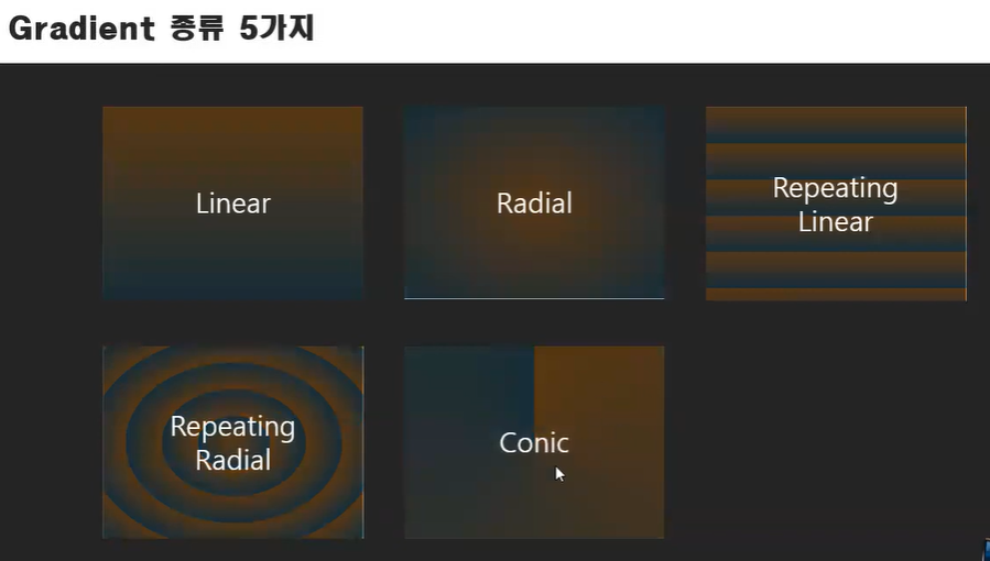
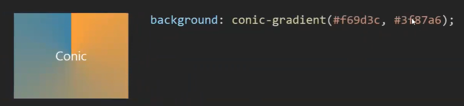
기본 사용 법 5가지


퍼센테이지를 주지 않으면 자연스럽게 그라데이션 효과가 나타나지만, 퍼센테이지를 주면 다음과 같이 그라디언트(그라데이션)이 없어진 것 처럼 표현된다.
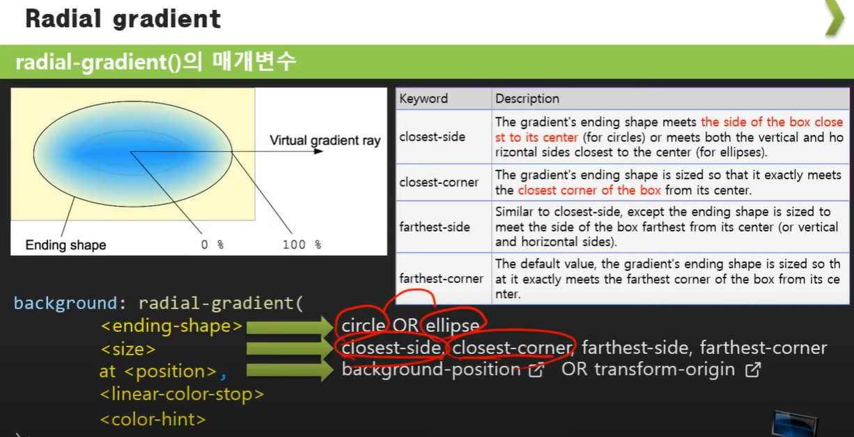
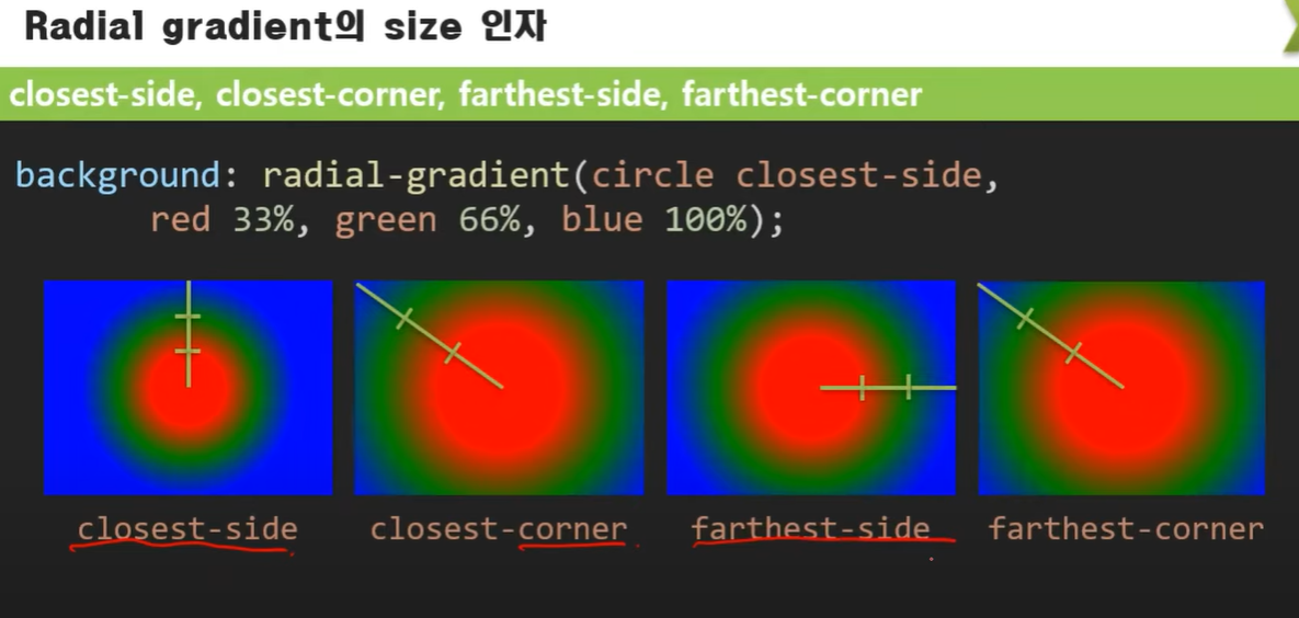
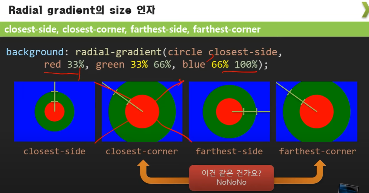
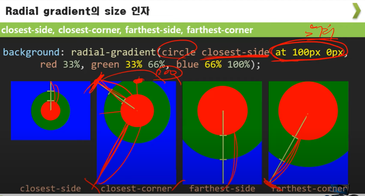
Radial gradient (원형 그라디언트)
https://developer.mozilla.org/en-US/docs/Web/CSS/gradient/radial-gradient()
radial-gradient() - CSS: Cascading Style Sheets | MDN
The radial-gradient() CSS function creates an image consisting of a progressive transition between two or more colors that radiate from an origin. Its shape may be a circle or an ellipse. The function's result is an object of the <gradient> data type, whic
developer.mozilla.org
반복 그라디언트

다중 이미지 넣기

예시(배경이미지와 그라디언트 동시 적용)
.header-welcome-bg-box{
    height: 244px;
    background: linear-gradient(
            to bottom,
            #A24F17, transparent
          ),
          url("../../images/1.jpg") no-repeat center/cover;
    overflow: scroll;
}
'CSS' 카테고리의 다른 글
| background-clip(백그라운드 이미지가 보여질 영역을 설정) (0) | 2021.12.18 |
|---|---|
| 백그라운드 옵션(backcround-attachment : scroll, fixed, local)-배경보다 창의 크기가 작을경우 (0) | 2021.12.17 |
| background-image 관련 css 내용 (0) | 2021.12.17 |
| 크기(또는 거리)를 나타내는 값의 단위 (0) | 2021.12.11 |
| 배경색을 칠하기 위한 값의 형태(RGB 색상 값) (0) | 2021.12.11 |